Case Study
Know Your Council
Power BI Data Dashboard
Summary
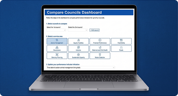
Situation: The Victorian Government’s public council-comparison dashboard needed rebuilding after its original platform was decommissioned.
Task: As Senior UX Designer, I needed to reconstruct and improve the experience in Power BI within a strict seven-week deadline, despite the platform’s limited support for custom interaction and accessibility.
Action: I reverse-engineered the legacy structure through heuristic review, designed custom workarounds for Power BI’s interaction gaps, and built a parallel accessible path to meet WCAG standards.
Result: Both dashboards launched on schedule, drew over 16,000 public page views, and earned stakeholder praise for not looking “like a Power BI dashboard.”
The Challenge
The Victorian Government’s public-facing Know Your Council website provides a critical service, empowering citizens and local government workers to compare Local Government Area performance metrics across a range of vital public service areas.
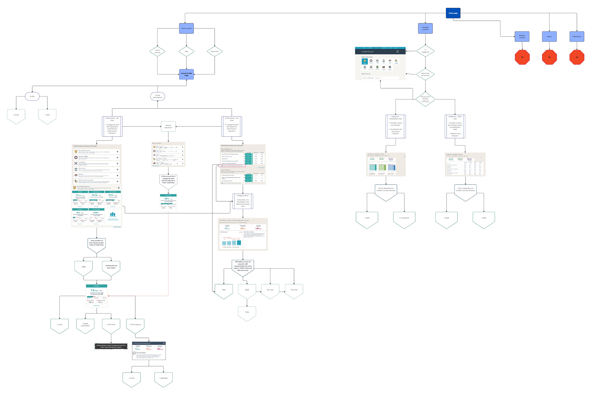
When our team was commissioned to rebuild this dashboard, we faced a constraint: the original, code-based platform built by an external party had been decommissioned and removed. Without the interfaces available, our only reference point was the archived, fragmented cache of the Wayback Machine.
In addition to reconstructing the past from these incomplete archives, we had to deliver the public-facing dashboards in only 7 weeks. Microsoft Power BI was chosen as the data platform, however it can be rigid when it comes to custom web-style interaction and responsive web design, and this brought some challenges to the project when trying to deliver the necessary features.
The Approach: Research and Information Architecture
To ensure we were building something useful rather than a replication, I conducted an intensive heuristic review of the legacy dashboard structures and static reports to identify historic usability friction points. I also established a close partnership with the Single Digital Presence (SDP) team’s UX and UI designers, seeking expert feedback during fortnightly public-sector design critiques to validate our interactive flows and ensure alignment with the state’s Ripple design system.
Because we were severely limited by the seven-week deadline, design and development had to operate in a highly collaborative parallel workflow. I started by creating a comprehensive sitemap in Miro based on the Wayback Machine findings, mapping out the complexities of the historical dashboard to identify where we could streamline steps to save development hours.
While our developer started modelling the necessary data schemas on the backend, I moved into Figma to design the ideal interface states, wireframes, and interaction flows.
Problem Solving Inside Power BI
Power BI is designed primarily as a business intelligence reporting tool and does not support the progressive, conditional workflow logic seen in modern web applications. This mismatch created two critical user experience challenges that were likely to challenge the mental models of our users and required custom design workarounds:
Challenge 1: Preventing Invalid Council Comparisons (The Progressive Logic Gap)
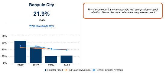
To maintain statistical integrity, it was required that users only compare “like-for-like” councils from similar socio-demographic and population groups, which were predefined by the stakeholders. However, Power BI cannot dynamically update secondary and tertiary dropdowns based on a primary selection while retaining active values.
- The Problem: If a user compared four councils from a specific cohort, and then changed the first dropdown to a council from a completely different group, the remaining dropdowns would fail to update, resulting in an invalid and misleading data comparison with no warning to the user.
- The Solution: Because we could not change this limitation in Power BI, I designed a custom error overlay. When the system detected a mismatched council selection, it covered the comparison charts with a clear, visual error-state screen alerting the user of the invalid comparison and guiding them exactly on how to update their preferences.
Challenge 2: Addressing Stale Performance Indicators
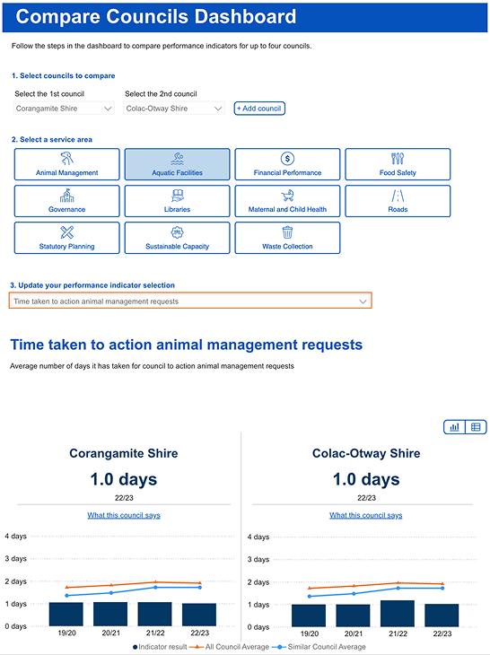
The dashboard utilised a three-step selection funnel: first selecting the councils, then selecting a service area, and finally choosing a specific performance indicator:
- The Problem: When a user selected a performance indicator (e.g., “Time taken to action animal requests” under the “Animal Management” service area) and subsequently changed their service area (e.g., to “Libraries”), Power BI did not reset the indicator selection. This left the user viewing an indicator from the previous category, creating a confusing experience.
- The Solution: I resolved this without relying on heavy, inaccessible modal pop-ups. I designed a bright, contextual visual highlight around the third dropdown and updated the instructional copy from “Select a performance indicator” to “Update your preference” whenever the parent category changed. This prompted users to correct their selection naturally in the flow of their interaction.
Accessibility as a Parallel Path, Not an Afterthought
Providing an equitable public service meant ensuring that the dashboard met strict WCAG digital accessibility standards. Power BI dashboards present significant barriers for assistive technologies and requires some careful enhancements to better meet accessibility requirements.
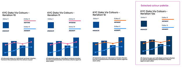
To ensure strict WCAG compliance within our tight timeline, I designed a parallel accessibility path that bypassed the nested iframe’s keyboard and screen-reader limitations. This involved creating a dedicated, text-based data table that opened in a separate browser tab to support seamless screen-reader navigation and browser zoom, paired with direct links to raw CSV datasets on data.vic.gov.au. To complement this, I spearheaded the colour accessibility strategy by implementing high-contrast colour palettes and prominent visual focus states that aligned with WCAG standards and the state’s VicGov palette, making the dashboard fully inclusive for low-vision users.
Outcomes and Learnings
Despite a decommissioned source site, severe Power BI interaction limits, and a seven-week delivery window, the project delivered outstanding results:
- Delivered on Schedule: Both interactive dashboard iterations were delivered on time and successfully integrated into the vic.gov.au website.
- High Public Engagement: From its launch in December 2023 to June 2026, the Know Your Council comparison dashboard recorded over 16,000 public page views.
- Praise for Design Polish: My styling and user-flow work bypasses the traditional, rigid “analytics” look. A senior stakeholder provided the ultimate compliment, stating that the delivered portal “looked nothing like a Power BI dashboard”.
- Positioned as Internal Specialists: The success of this project established our internal team as recognised public sector specialists in designing human-centred, WCAG-compliant data products.
Key Learnings:
- Embrace Parallel Workflow: When timelines are short, developers and designers must work in parallel rather than sequentially. Designing wireframes in Figma while backend data modelling is occurring reduces bottlenecks and identifies data issues which might impact the design.
- Design with Constraints in Mind: Platform limitations shouldn’t prevent good experiences. By designing simple custom error states and contextual guidance, we can guide the user around unavoidable software constraints.
You can find the dashboards published here on vic.gov.au (opens in a new tab).
A note: Since it’s release, the owner of the dashboard has made changes which depart from the designs shown in this case study.